Graphic Design for Education

Graphic Design for Education

Graphic design for education brings the power of learning into information that is faster to process and easier to remember.

I’ll turn your information into a meaningful, understandable tool for educational purposes.

Learning Comes First

Even when your information is complete, understanding the content is a challenge without using graphic design.

Whether teaching 6th graders about grammar, creating an educational online video, or designing an instructional PowerPoint for testing, my approach to graphic design for education makes your content more relatable to students (including the use of WCAG and ADA-compliant media).

Graphics vs Description - which works better?

One inch vertical
One inch horizontal
90-degree angles
Four equal sides
Solid blue color
Four corners
Straight edges

blue square

One inch vertical
One inch horizontal
90-degree angles
Four equal sides
Solid blue color
Four corners
Straight edges

blue square

Tackling Educational Promotion

When approaching graphic design for education, I use consistent styles throughout the project (fonts, colors, hierarchy…). These styles create a tool for fast understanding and memory enhancement.

Stream My Sport needed assistance with the launch of their new program that helps sports-based students get into college. A variety of marketing tools, such as video, direct mail, website, and other marketing materials, were created to target high school graduates. 

When approaching graphic design for education, I use consistent styles throughout the project (fonts, colors, hierarchy…). These styles create a tool for fast understanding and memory enhancement.

Stream My Sport needed assistance with the launch of their new program that helps sports-based students get into college. A variety of marketing tools, such as video, direct mail, website, and other marketing materials, were created to target high school graduates. 

Function with Form

When laying out graphic design for education, I use consistent styles throughout the project (fonts, colors, hierarchy…). These styles create a tool for fast understanding and memory enhancement.

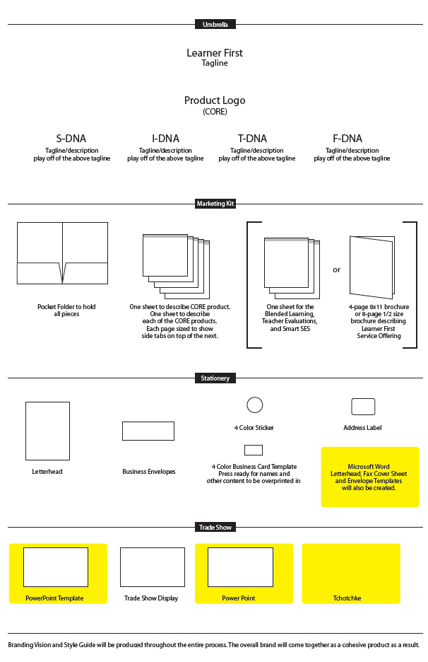
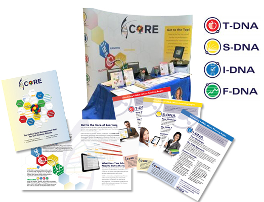
I approach these projects not just by creating visually appealing material, but by designing a custom theme while blending design with succinct information and a strong visual solution, enhancing retention and clarity for students and the public.

When laying out graphic design for education, I use consistent styles throughout the project (fonts, colors, hierarchy…). These styles create a tool for fast understanding and memory enhancement.

I approach these projects not just by creating visually appealing material, but by designing a custom theme while blending design with succinct information and a strong visual solution, enhancing retention and clarity for students and the public.
Case Study:
Council on Children and Families

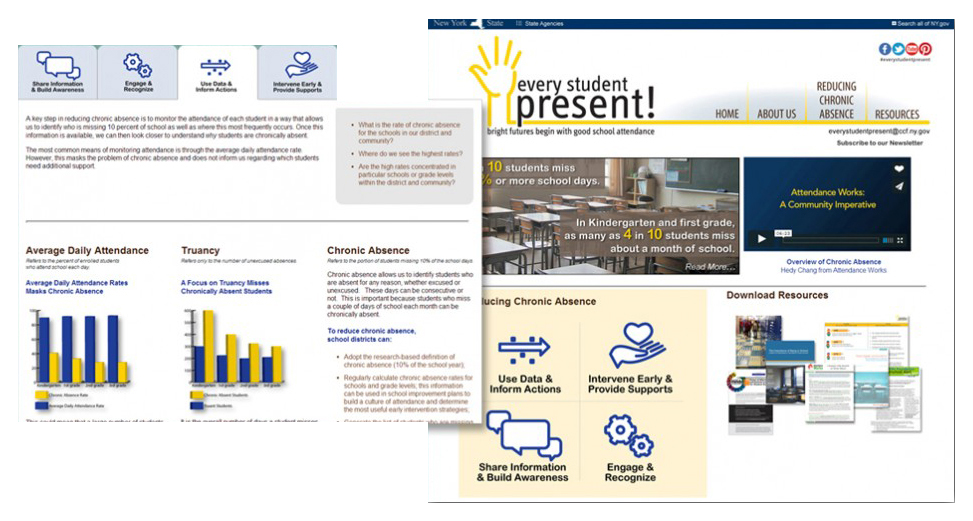
Focusing on the health, safety, and education of children, the goal for the Council on Children and Families was to appeal to its audience with an abundance of informational pieces. Most showed up at events looking for resources with easy, quickly recognizable information and strong, understandable content.

Council on Children and Families style matching

Make it Simple

I designed a series of print products for long-term purposes, turning complex information into simple-to-understand content. This easy-to-navigate graphic system revealed a complex series of consistent charts, imagery, and a design scheme that was simple, consistent, and concise.

How Kids Count

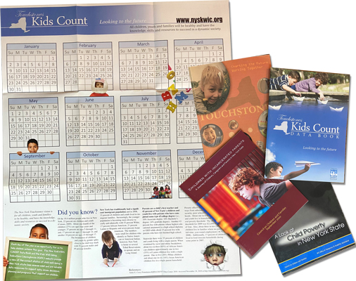
The Kids Count project was specifically created to increase educational resources. The print media consisted of booklets, handouts, response cards, and a 24”x32” fold-out events calendar. These items were designed to provide information using the Council of Children and Families’ overall theme while creating an individualized style and format specifically for the Kids Count package.

Council on Children and Families Print pieces